Experiment 2 - The lenses of your eyes

The lenses in your eyes suffer from chromatic aberration - it’s just that your brain usually edits it out.
Make the aberration dramatic enough and your brain can’t deal with it.
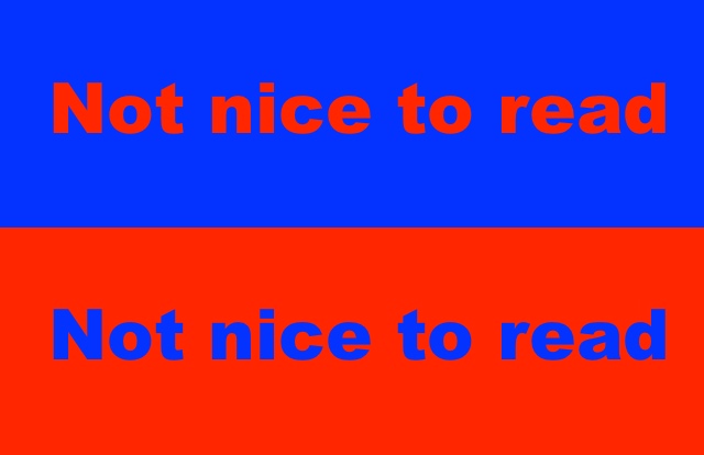
That’s what happens when you have blue lettering on red or red lettering on blue. The brain struggles to cope with the distortion and can’t quite hide it away.
The text is difficult to look at - it seems ‘wrong’ in some way that it’s hard to explain. This is your brain failing to deal with the chromatic aberration that is always present, but here is too strong to edit out.
The text is difficult to look at - it seems ‘wrong’ in some way that it’s hard to explain. This is your brain failing to deal with the chromatic aberration that is always present, but here is too strong to edit out.
